Heatmap Plotting#
In this tutorial, we will demonstrate how to use the heatmap function from the pymovements.plotting module to create a heatmap of gaze data. The heatmap will show the distribution of gaze positions across the experiment screen, with color values indicating the time spent at each position in seconds.
Preparations#
We import pymovements as the alias pm for convenience.
[1]:
import pymovements as pm
/home/docs/checkouts/readthedocs.org/user_builds/pymovements/envs/stable/lib/python3.9/site-packages/tqdm/auto.py:21: TqdmWarning: IProgress not found. Please update jupyter and ipywidgets. See https://ipywidgets.readthedocs.io/en/stable/user_install.html
  from .autonotebook import tqdm as notebook_tqdm
Loading the Dataset#
Let’s start by downloading our ToyDataset and loading in its data:
[2]:
dataset = pm.Dataset('ToyDataset', path='data/ToyDataset')
dataset.download()
dataset.load()
Using already downloaded and verified file: data/ToyDataset/downloads/pymovements-toy-dataset.zip
Extracting pymovements-toy-dataset.zip to data/ToyDataset/raw
100%|██████████| 20/20 [00:00<00:00, 20.58it/s]
[2]:
<pymovements.dataset.dataset.Dataset at 0x7f0bec22d8b0>
After loading the dataset, we will transform the pixel coordinates to degrees.
[3]:
dataset.pix2deg()
100%|██████████| 20/20 [00:01<00:00, 10.46it/s]
[3]:
<pymovements.dataset.dataset.Dataset at 0x7f0bec22d8b0>
We now have a position column available:
[4]:
dataset.gaze[5].frame
[4]:
| time | stimuli_x | stimuli_y | text_id | page_id | pixel | position |
|---|---|---|---|---|---|---|
| f32 | f32 | f32 | i64 | i64 | list[f32] | list[f32] |
| 2.415266e6 | -1.0 | -1.0 | 1 | 1 | [176.800003, 140.199997] | [-11.420403, -9.148146] |
| 2.415267e6 | -1.0 | -1.0 | 1 | 1 | [176.699997, 139.800003] | [-11.422806, -9.157834] |
| 2.415268e6 | -1.0 | -1.0 | 1 | 1 | [176.699997, 139.300003] | [-11.422806, -9.169944] |
| 2.415269e6 | -1.0 | -1.0 | 1 | 1 | [176.600006, 139.300003] | [-11.425209, -9.169944] |
| 2.41527e6 | -1.0 | -1.0 | 1 | 1 | [176.699997, 139.300003] | [-11.422806, -9.169944] |
| 2.415271e6 | -1.0 | -1.0 | 1 | 1 | [176.800003, 139.5] | [-11.420403, -9.1651] |
| 2.415272e6 | -1.0 | -1.0 | 1 | 1 | [177.300003, 139.800003] | [-11.408385, -9.157834] |
| 2.415273e6 | -1.0 | -1.0 | 1 | 1 | [177.800003, 140.0] | [-11.396368, -9.15299] |
| 2.415274e6 | -1.0 | -1.0 | 1 | 1 | [178.300003, 140.0] | [-11.384349, -9.15299] |
| 2.415275e6 | -1.0 | -1.0 | 1 | 1 | [178.300003, 139.899994] | [-11.384349, -9.155412] |
| 2.415276e6 | -1.0 | -1.0 | 1 | 1 | [178.0, 140.199997] | [-11.39156, -9.148146] |
| 2.415277e6 | -1.0 | -1.0 | 1 | 1 | [177.699997, 140.399994] | [-11.39877, -9.143302] |
| … | … | … | … | … | … | … |
| 2.438308e6 | -1.0 | -1.0 | 1 | 1 | [649.099976, 633.700012] | [0.240135, 3.033792] |
| 2.438309e6 | -1.0 | -1.0 | 1 | 1 | [648.799988, 633.900024] | [0.232631, 3.038749] |
| 2.43831e6 | -1.0 | -1.0 | 1 | 1 | [649.099976, 634.099976] | [0.240135, 3.043703] |
| 2.438311e6 | -1.0 | -1.0 | 1 | 1 | [649.599976, 634.200012] | [0.252642, 3.046182] |
| 2.438312e6 | -1.0 | -1.0 | 1 | 1 | [650.099976, 634.099976] | [0.265148, 3.043703] |
| 2.438313e6 | -1.0 | -1.0 | 1 | 1 | [650.0, 634.0] | [0.262648, 3.041226] |
| 2.438314e6 | -1.0 | -1.0 | 1 | 1 | [649.900024, 633.900024] | [0.260147, 3.038749] |
| 2.438315e6 | -1.0 | -1.0 | 1 | 1 | [649.900024, 633.900024] | [0.260147, 3.038749] |
| 2.438316e6 | -1.0 | -1.0 | 1 | 1 | [650.099976, 633.700012] | [0.265148, 3.033792] |
| 2.438317e6 | -1.0 | -1.0 | 1 | 1 | [650.200012, 633.5] | [0.267651, 3.028836] |
| 2.438318e6 | -1.0 | -1.0 | 1 | 1 | [650.0, 633.200012] | [0.262648, 3.021402] |
| 2.438319e6 | -1.0 | -1.0 | 1 | 1 | [649.700012, 633.099976] | [0.255144, 3.018923] |
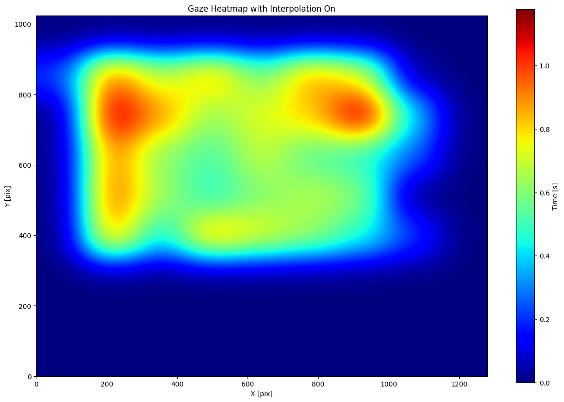
Creating a Heatmap#
Let’s create a heatmap using the heatmap function from the pymovements library. We will use the default gridsize of 10x10 with interpolation and display the colorbar.
[5]:
figure = pm.plotting.heatmap(
    gaze=dataset.gaze[5],
    position_column='pixel',
    origin='upper',
    show_cbar=True,
    cbar_label='Time [s]',
    title='Gaze Heatmap with Interpolation On',
    xlabel='X [pix]',
    ylabel='Y [pix]',
    gridsize=[10, 10]
)
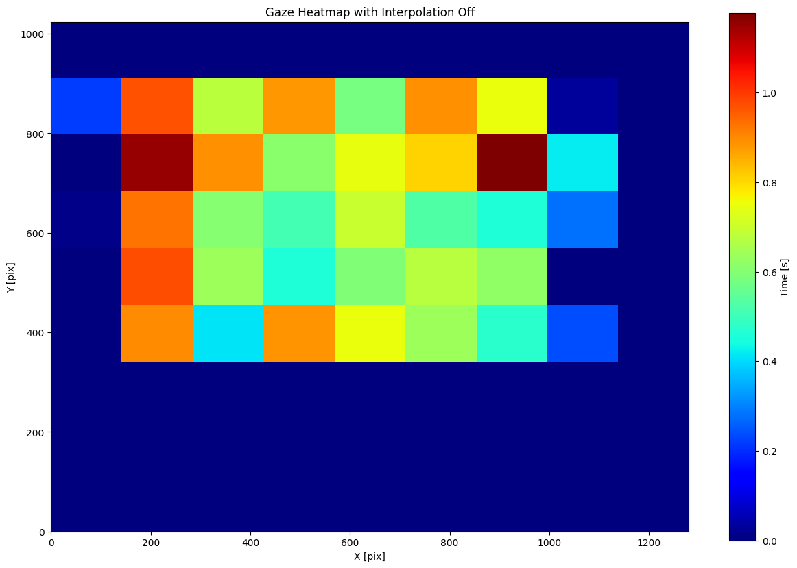
To better understand the effect of the gridsize parameter on the heatmap, we can turn off the interpolation. By doing this, we can clearly visualize the individual bins used to calculate the heatmap. With interpolation turned off, the heatmap will display the raw bin values rather than a smoothed representation.
[6]:
figure = pm.plotting.heatmap(
    dataset.gaze[5],
    position_column='pixel',
    origin='upper',
    show_cbar=True,
    cbar_label='Time [s]',
    title='Gaze Heatmap with Interpolation Off',
    xlabel='X [pix]',
    ylabel='Y [pix]',
    gridsize=[10, 10],
    interpolation='none'
)
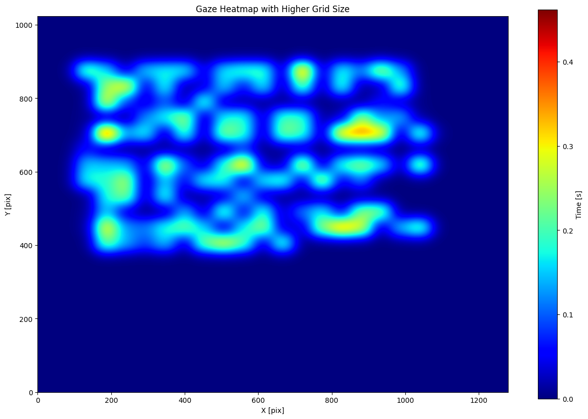
Increasing the gridsize parameter results in a finer grid and more detailed heatmap representation. With a higher grid size, we divide the plot into smaller bins, which can capture more nuances in the data distribution
[7]:
figure = pm.plotting.heatmap(
    dataset.gaze[5],
    position_column='pixel',
    origin='upper',
    show_cbar=True,
    cbar_label='Time [s]',
    title='Gaze Heatmap with Higher Grid Size',
    xlabel='X [pix]',
    ylabel='Y [pix]',
    gridsize=[25, 25]
)